|
|
|
|

|
|
|
2009
|
|
|
590 St. Mary's Road
Location Map
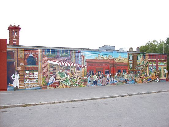
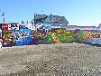
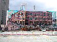
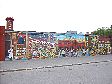
'European Market Square'
Establishing shot of this extremely detailed wall. Photos 2-6 show closer examination of the detailed artwork. Photos 7-13 show a chronology of the progress on the wall.
|
Location: Just South of St. Mary's-St. Anne's Junction; West side; North Face
Occupant: Miller's Super Valu Meats
District: St. Vital
Neighbourhood: Elm Park
Artist(s): Sarah Collard (Collard Creations)
Year: 2009
|
|
|
Mural of the Year 2009
A brief description of the Mural:
Sarah Collard: "People wander through the open air market, chat with others, walk their
dog, look for quality foods and begin to line up at the most popular store around; Miller's
Super Valu, formerly known as Miller's Meats, established in 1971, a fresh Winnipeg
meat market. They congregate in the Piazza (meeting place) guarded by the Golden Boy;
a magnificently gilded figure, a proud Manitoban symbol. Embodying the spirit of
enterprise and eternal youth, he is poised atop the dome of the parliament building in
Winnipeg or Vatican City, Rome. Nestled behind is an architectural suggestion of the
market square in Brussels, Belgium and a narrow European street to its left. The Italian
piazza encloses fresh fruit and vegetable stands manned by storeowners. A Red River
Cart stops in busy traffic near the outdoor cafe and Super Valu."
"On the far left a delicious French bakery displays treats in its storefront window manned
by a historical shop owner. When one looks closely "Dolce Dia" is written on a sign in
the bottom of the bakery window, it is a Spanish saying that means 'Have a Good Day'.
The shop owner watches over the square from Fortune's Block, a former Winnipeg fruit
and vegetable store that once doubled as M. Fortune's Land Office. A Winnipeg resident
stopped by the wall one day and informed me that her relatives were Fortunes and the
store still exists downtown, located on Main Street, between York and St. Mary Avenue,
on the West side. Her relative was quite wealthy but died on the Titanic, money and
all."
"On the far right, two Jewish businessmen lean against their building that used to be
Hollman's, a former meat market. In the mural it represents Top Hat Florist, a business
that is well established in Winnipeg. Colours are reminiscent of a Tuscan countryside,
bringing attention to a newly renovated storefront."
"The figures lining up to get into Miller's were taken from snapshots taken at St. Norbert
open air market. The owner's son, Shawn Miller is seen skateboarding behind the
fountain in the market square."
Additional commentary:
Sarah Collard: "The mural was initiated by Sandra and Cameron Miller who wanted to
renovate the front of their store and replace an existing Mural that was a landmark in the
area. It was one of the first large scale murals in Winnipeg, painted by James Culleton in
1996. Since they were redoing the front they wanted the Mural redone as well. Sandra's
idea was to make a European piazza or square where people are meeting, vendors selling
and where Miller's would be a hub of activity. They had recently been to Europe and
wanted to bring some Italian flavour into the Mural. As I also have done an extensive
European tour with Italy being one of my favourites, it was a good match. The ideas took
about a month to combine as the husband and wife had varying vision. She wanted an
Italian looking piazza with lots of people wandering in a quaint setting and Cameron
wanted a busy place that emphasized his successful quality business."
"The result is a compilation of both their ideas. There are old historic buildings such as
Fortunes block to the left (still located on Main Street); Holman's butcher shop which is
seen on the right, and Top Hat Florist (a business that has been around for as long as
Millers). After a trip to Manitoba Archives I was able to dig up many gems such as
Jewish businessmen sprinkled at either end of the composition in front of external
architectural facades. Flipping through Jewish archives was one of my favourite things to
do as I was able to catch a glimpse of their fascinating history and realized what a huge
part they have played in Winnipeg's cultural foundation. I was able to mix old with new.
I used the old photographs but placed them in a modern scene. The contemporary figures
of the square were taken from photographs of St. Norbert's farmers market. "
"At first I started with a strip of antique stores, thinking of Serge Malifante's famous
MUIRS team that produced historic French buildings with super realism. However,
Cameron said that is what they had last time and asked for more depth in the picture. I
had difficulty understanding a piazza idea but once I looked at photos of Vatican square
and St. Mark's in Venice, then I understood. It was kind of difficult creating a square
that was set back but in some ways it added height as the building grew smaller with
distance. Painting the floor in squares was a must, as that is how the Vatican is in reality.
The Vatican also had to be the tallest structure in the city as it does in Rome as well.
There are also fountains and painted tiles that create patterns in the outdoor stone. After
a trip to Assiniboine Park gardens I got the idea to do a formation around a fountain that
mimicked a walkway. Filling it up with people made it a bustling place; busy, busy, busy
(which in reality it is). The golden boy is placed on top of the Vatican as a symbol of
harvest and prosperity."
"Veggies and fruit are in abundance. Lining the street are shops filled with items that
Millers stock; baking, vegetables, fruit, chocolate, meat and cheese. Nestled in a brick
wall is a wine store filled with vintage that accompanies most Italian dinners. Growing
up myself with an Italian mother and grandparents made Italian nuances a delight. I
translated bakery, wine and cheese into the Italian 'Panificio' 'Vino' and 'Formaggio'.
The cafe was originally entitled 'Bar Italia' but I changed it to read 'Luogo d'incontro'
which means meeting place. I thought this was more in line with the mood that Sandra
was trying to achieve. I added some Italian bread, (also French baguettes) and vegetables
that I can remember eating as a kid: cantaloupe, bell peppers, eggplant, zucchini, iceburg
lettuce, tomatoes, red cabbage and chestnuts (or cestanias as we called them). I tried to
hang some Genoa and Calabrese salami in the window of Millers (not sure if you can
tell?) but I forgot the provolone."
"I like how the figures relate to the food especially the girl in the baby blue, examining
the produce. The Asian girl on the right is also one of my favourite figures as she is seen
in contemporary garb, hugging her cell phone (another of my pet peeves), telling her
friends about the Ukrainian Easter eggs lining the table. The girls chatting behind her are
nicely rendered as I spent an entire half day on the straw hat and lemon shirt. The
sunlight radiates nicely off her as I was particularly careful to take advice from John
Nobrega/Alan Bender who stress 'use the colour' to create light NOT white. If you look
closely you will notice the highlighted areas are made with a cool blue colour and the mid
tones are shades of red or orange (warm colours). For whatever reason, the Flemish
painters discovered this technique and it seems to work."
"In the background is a patio scene meant to mimic Bar Italia's outdoor patio and many
outdoor cafes in Europe. The guy and girl sipping on green iced tea are supposed to be
my lawyer and myself finalizing divorce papers. I guess it is a bit of a self-portrait as I
used to have long hair and he always wore shades. It symbolizes the beginning of a new
phase in my life where I begin (again) to work full time as an artist and begin (again) to
be a single mother."
"The flowers that I chose for the florist were also Italian and relate to Winnipeg. I chose
hydrangeas and orchids as I knew they were family favourites. Hydrangeas I remember
seeing in my Grandmother's garden and at Assiniboine Park Conservatory at their
Mother's Day open house; and orchids I always associate with rare quality as they are
difficult to grow and need a warm climate. The blue and purple hydrangeas were always
my favourite, big and splashy colour."
"The bakery is filled with Spanish pastries but is actually located in France. The doilies
are reminiscent of handmade needlework that my Great Grandmother used to do. 'Dolce
Dia' is Spanish for 'Have a good day'."
"The painting took two full months, and I finished on October 1. The wall was not devoid
of problems. One of the most difficult tasks was to paint the three-dimensional aspects of
the wall. This baby's face is painted directly on the exhaust pipe. Miller's son Shawn is
depicted on a 3 foot wooden door, lifting his skateboard behind the fountain in market
square. He requested on the logo being represented on his shirt. "
"If there is one thing I would change it would be to improve on the historical figures that
I got from the archives. The photographs were good as historical archives, however it is
difficult for me to make out their faces, so if you notice the two end figures are not very
detailed and I find them a bit awkward. Some artist friends have suggested dressing up
models in historical attire and photographing them which would give me more details to
work with. I have yet to put this information to good use. The costume museum in
Winnipeg would be a helpful source for this kind of venture- one I hope to achieve in
the future."
"I hope you enjoy this work, as I have definitely loved painting it. I am thankful to
Cameron and Sandra Miller for giving me wind to let my talent sail. It is the largest wall
I have painted so far (1250 square feet) and I am sure it will be an important one to look
back on."
|
|