|
|
|
|
|
|
Atb.jpg)


|
|
390 Graham Avenue (Transit Box)
Location Map

'Bus Stop'
|
Location: S Side Graham bet Kennedy & Edmonton at bus stop
Occupant: Transit Controller Box
District: City Centre
Neighbourhood: South Portage
Artist(s): Sarah Collard (Collard Creations)
Year: 2007
Sponsors: Downtown Winnipeg BIZ, Take Pride Winnipeg!
|
|
|
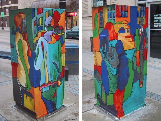
Sarah Collard: "It is entitled 'Bus Stop'. I wanted to design something that was related to transit
and the Graham Avenue mall. I wanted people standing around, walking and shopping. I wanted it to be
somewhat realistic, and I did these blind contours of people. Some were students, and some were
people that were walking on Graham. A blind contour is a line drawing that involves looking at your
subject and drawing their outline without looking at the page, only at your subject. It's all done by feel and
it's all based on your perception. With this technique it begins to be abstracted, and that's the part that I
like."
"When I'd finished the figures, I put them into scenes based on what was around me on Graham Avenue.
When it came to colouring the scene, I didn't look simply at the background landscape and colour the sky
blue and the grass green! Rather I thought in terms of shapes and coloured the shapes. I coloured
everything and sectionalized it, including the folds in the clothing. I did strive to balance out the colours
overall. Each of the figures is surrounded by its black outline, and the colours are divided by these black
lines."
"All of the colours seemed to work together, and I was constantly walking around it to see that everything
went together, and that each panel moved into the next panel. While I was painting there they actually
moved the bus shelter which it stands so close to, which allowed me to paint the fourth side (N.B. the
competition from which this winning design was chosen had only required design on 3 of the 4 sides, see
photo 2). It wasn't expected of me to do the fourth side but I did it anyways- I think it looks better!"
"I'm totally pleased with this one, because I think it was creative, colourful and fun. This was the last of
the three that I submitted for this competition and there were time constraints as it was approaching the
deadline. The other two were more technical, so this one I could be more creative, experiment and play!"
|
|