|
|
|
|
|
|
Atb.jpg)
|
|
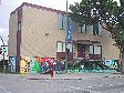
270 Sherbrook Street
Location Map
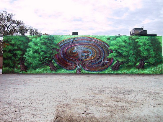
"The Labyrinth of Lifelong Learning".
|
Location: W side bet. Portage & Broadway; North Face
Occupant: Creative Retirement Manitoba
District: West End
Neighbourhood: West Broadway
Artist(s): Charlie Johnston (C5 Artworks), Sarah Johnston
Year: 2003
Sponsors: West Broadway Small Grants Fund, Neighbourhoods Alive! (Manitoba), Sum Quod Sum Holdings, Creative Retirement Manitoba, Take Pride Winnipeg!, The Rotary Club of Winnipeg West
Painters: Betty Smith, Rahsmi Mehta, Ellen Hartle, Elyssa Stelman, Dara Finlay, Art City, Wolseley Family Place
|
|
|
Ingrid Wedlake (program manager, Creative Retirement): "When we first moved to this
building a year ago we realized the area lacked character because of the empty lots
around us so we thought it would be really nice to brighten up the wall. Initially we were
going to do something to promote Creative Retirement but we thought it would be really
nice gesture if we did something a little more community-based."
Ellen Hartle (Mural coordinator, Creative Retirement): "I approached Charlie with just a
concept and a drawing of this labyrinth designed by Anne Nesbitt, our labyrinth
instructor. She teaches people about the labyrinth and its history that is about 5000 or
6000 years old: what a labyrinth is, why it exists, why people use them, the myths and
facts about labyrinths. She has huge canvas portable labyrinths that she carries around
when she goes to schools; and people use walking the labyrinths as a meditative tool.
She also has a labyrinth at her cottage and she held her weekend retreat for us this past
summer around the labyrinth. The participant can enjoy the labyrinth on whatever level
they wish. You'll not get lost in the labyrinth; it's a path and you follow it. We try to
educate people that a maze and a labyrinth are two different things: a maze is designed to
lose you and a labyrinth you don't get lost in. It goes to a center and comes back out.
The Manitoba labyrinth society has been a supporter of this project and we do courses on
labyrinths."
"Since a labyrinth has to be kind of circular, Anne initially thought that for this long wall
we needed to do three labyrinths side-by-side to fill out the wall and keep the shape
correct. Charlie didn't think visually this idea would be that workable, and said 'what if
people are up in trees looking down on the labyrinth instead.' He sketched his idea on a
piece of paper, and this rough early sketch became the basic layout of what is now the
finished wall! I still have that early sketch."
"The design and the painting evolved so much in the process that was fascinating to work
with Charlie and Sarah and all of the other artists; it's been the most creatively satisfying
project that I've worked on in my time here."
Charlie Johnston: "This was a very enjoyable project for us. The people were great!"
Sarah Johnston: "One component of it that I really liked was the involvement of the
different women in the community, and the children. The women were from different
facets, different phases of life, different walks of life, different cultural orientations.
Charlie's daughters were there too!"
Charlie: "Yes, the matriarchal aspect of it too; having people that have seen life and lived
a full long life, bringing what they had to the creative process. It was a dynamic type of
experience. I tried to keep our possibilities open as opposed other situations where you
have to work very closely to a strictly dictated design. We were working with a broad
concept; the fact that was going to be a garden labyrinth was the key element, but other
than that we were exploring different possibilities: how do we integrate the different
styles, the different people, and what kinds of things we can bring out as we go through
the process. That way there were lots of creative possibilities to change the design as the
project evolved. Everything wasn't cast in stone as to how it was going to look at the
end, which was great!"
"The way that we broke up the elements of the design where each of the women wound
up working on different phases of the wall pattern- I thought that was a really wonderful
metaphor of how each person's expressive style came out from a different floral pattern
and through a different manner of painting; and it still stayed together as one
image."
Sarah: "The way each person painted kind of reflects where they are in their lives. Elyssa
(the Concordia Fine Arts student) was very good, she had no fears- she'd get herself all
set up and do her thing; and I feel her energy was caught in there. Whereas Betty, who
had a lot of life experience under her belt and survived breast cancer, her style was more
calm and gently expressive with a greater sensitivity."
Charlie: "Dara was very methodical, and spent a lot of time on the water lilies and lotus.
She concentrated a great deal on that; and she brought a different type of methodology to
the project. Rahsmi brought a lot of the elements of her culture with her as she painted:
bright rich colours, tapestry, patterns: the characteristics of her East Indian culture would
be expressed through her brush strokes, which was really neat. And these different styles
were beside each other and complementing each other. For Sarah and I, it was the trees.
Sarah painted the trunks of the trees in her style, and I painted the leaf patterns in my
style. It was a real exciting way for us to bring our artistic styles together because we
have very different styles as well."
Sarah: "Some of these women, like Betty and Rahsmi are seniors and retired, and there
were days that it hit 34 degrees. And yet they came, wanting to work, and wanting to put
themselves into this project. They had a great spirit and the right spirit. It was also a neat
information sharing experience, and I feel that somehow all this information and stories
we shared WENT INTO THE WORK, the energy of it. It was a very positive
experience."
Ellen: "They were faithful contributors and were here all the time. It was quite brave of
them to be up on the lift working up high and neither one of them had worked on a Mural
before."
"The Mural's labyrinth is shaped like a human brain. It's cool! It shaped like a cerebral
cortex. When the grade six students from Mulvey school asked their teacher why it
looked like human brain, her reply was 'it's about learning so it should look like human
brain!' I loved that answer! 20 years ago Charlie was going to do a bulging human
brain with a cap over the dome of the planetarium; so when he saw the shape of the
labyrinth he said 'there's the brain again!' But in fact it was more of an accident; we
didn't plan it deliberately to look like the human brain, at least not on a conscious
level!"
"The labyrinth is like the journey of life. Part of the meaning of the labyrinth comes from
the reaction that people have had to it. One day I went out at lunchtime and a secretary
from the United Church was having her lunch in the car and she says I come here my
lunch hour just to sit and gaze at this thing and relax. It's so peaceful and so meditative
that it just transports her. And I thought what kind of gift are we giving to our
community! I was so pleased. We've had tourists from the states drop by. We had
others say 'oh it's so spiritual!' And even Charlie and Sarah said while they were
working on that the Mural was having a dialogue with them. I'll tell you something that
was really fun was being out there and having the big burly guys from the city of
Winnipeg, Manitoba Hydro, or what have you parking their trucks on their coffee break
at Tim Horton's, and they'd come and talk to me about the Mural and now much they
liked it, and what did it mean, and what they thought of it. It was all very positive
comments."
"The Carol Shields character wasn't there in the beginning."
Charlie: "Two things happened: a passerby said to me that it was wonderful that we were
doing a labyrinth Mural, because author Carol Shields had passed away and the central
figure in her book Larry's Party was a labyrinth designer. A day or two later, Morley
Walker wrote in the Free Press that Winnipeg needed to do something to recognize and
commemorate the life of Carol Shields, perhaps a labyrinth garden in Assiniboine Park!
There you go! That was the sign! A lot of our reference photos came from Assiniboine
Park for the floral patterns that we used and the textures of the ground. So that was good
enough for me! So symbolically Carol Shields is there at the center the labyrinth. Betty
(Smith) and Carol were friends in a breast cancer survivor support group."
Ellen: "Betty Smith, a breast-cancer survivor had worked on the wall at the beginning
putting the base paint on as a volunteer. She did it as a learning experience and her
whole relationship with Charlie and Sarah just evolved she had such a good time with
them. Charlie took the image of Betty and her husband and put them in the labyrinth.
We didn't really want to play up who the people were because they were more directed as
somebody alone, a couple, somebody young, somebody old. And I believe it's perfectly
fitting that we have somebody deceased. Carol and Betty were friends as breast-cancer
survivors. The reason Carol is holding the White Rose is that Betty goes to Dragon Boat
races, and they throw a White Rose on the water as a tribute to friends they've lost. The
message is we travel through life and the labyrinth is the metaphor for our life journey.
Obviously we age as we go through life; you come to middle point in your life and then
you go back out, perhaps as a changed person from the one you were the first part of your
life."
"The scene is supposed to be a Birdseye view; that's why there's no sky. The figures cast
shadows. At times it was very hot, and when you try to paint in 33 degree weather, the
paint is drying while it's still on the brush. The whole time Sarah worked on it she was in
the shadow of the trees in the morning, and that's why she's represented standing in the
shade of the trees. And that's why the tree branches wrap around the back of the
building; it's a 'shadow' of the trees onto the back of the building."
Charlie: "Sarah and I got married during the labyrinth Mural, so it was a celebrative time,
and definitely had an impact on the Mural. That's the way that our experience with the
Mural got pulled into the image itself. I rendered the two of us entering into it like that
with Sarah waiting for me in the shade."
Normally on a Mural project, the client doesn't give much help in terms of research,
collaboration, and general assistance as what was the case here. Normally, those things
are the artists' burden. In this case, it was quite happy collaboration; but at the same
time, Hartle stresses that they wanted to give Charlie lots of freedom to do the piece the
way he saw it, and did not interfere with that in any way.
Ellen: "We did internet research on the butterflies and moths of Manitoba, various
flowers, toads for the Mural and then the kids would paint them on the wall. There must
be a couple of dozen types of flowers on the wall. The nightclub upstairs saw the
progress of the Mural and the beautiful and colourful garden labyrinth, and wanted to
contribute some funds for the project as well. The rainbow of flowers was a happy
development in terms of the diversity that we're trying to represent in the
labyrinth."
Charlie: "It was a real community-based type project. It was about something earthy
dreamy and something meditative. The idea was for it to be a meditative thoughtful piece
and pull you in on that level and I really think it worked in that way. We've gotten that
kind of reaction from people throughout the whole thing. They felt it had that quality to
it. It could have been a stone labyrinth rather than a garden labyrinth but we thought this
worked better. It has a real summer quality to it which is fitting because that's when we
did it. When we finished it, I was excited to see how it would look in the wintertime
when everything is gray and white-to have this beacon of green coming out from that
space!"
Ellen: "We did this as a community development piece to beautify the neighbourhood.
Creative Retirement wants to be part of the neighbourhood. This is a really good way of
linking up with other agencies in the neighbourhood. We had hoped to have more of the
children's involvement on the large Mural, but we couldn't get it started while school was
still in session, so the closest we got was getting them to work on the panels that we
installed on the front of the building."
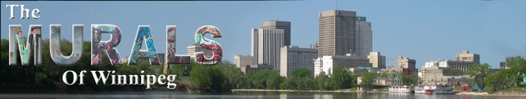
In fact, students from Mulvey school as well as students and adults from Wolseley
Family Place and from Art City painted the artwork (consisting of four sections) which
adorn the front of the building (see photo 3). Charlie Johnston and Ellen dubbed this
group "KAYAK" short for Kommunity and Youth Art Konsortium, a great moniker for
the collective group that worked to help extend the Mural themes to the front of the
building. After the artwork was completed, the Mural was erected and mounted above
the front entrance by Charlie Johnston, with the assistance of Jason Brewster, a visiting
student from Trinidad.
Carey Sinclair (Wolseley Family Place) was the lead artist for their contribution (photo 3;
the left quarter section of the Mural): "The Mural we did for Creative Retirement consists
of two panels that represent aboriginal values and the medicine wheel. The first shows
four figures done in different colours. The colour Red represents a Baby who would sit
in the East. Blue represents the Adolescent who sits in the South. Yellow is the Adult
and would sit in the West. Finally White is for the Elder who sits in the North. This is
not to say that these nations stay in these stages, but that there are different stages of life
we go through. The colours represent the directions: Red for the East, Blue for the South,
Yellow for the West, and White for the North."
"Also each direction represents nations. East (Red) is for the people of this land of
aboriginal descent and such. South (Blue) is for the people of colour. West (Yellow) is
for people from Asia and such. North is for the White people. Each direction also has an
animal to represent it, and other things such as medicines and the elements which I did
not include."
"The second panel has the text: 'All Nations Hold These Teachings.' It also has colours
to represent each direction and nation. In each hand there is an animal which represents a
teaching. The Eagle is Love, the Beaver is Wisdom, the Turtle is Truth, the Buffalo is
Respect, the Wolf is Humility, the Bear is Courage, and the Sabe (also known as the
Sasquatch) is Honesty. I want to elaborate a little more on the text. The text and the
different colours and figures are to show us how to share with each other, as well as with
each and every nation. It is not just for the people who choose to only share with, but all
is to be shared by the human race, not as separate nations."
Carey Sinclair had the assistance of the following young artists: Anita, August, Conor,
Curtis, Cynthia, Darryl, Darrylynn, Delia, Destin, Diane, Florene, Juliana, June, Katrina,
Margaret, Marla, Nancy, Ronda, Stephanie, Steve, and Sylvester.
The other 3 sections of the front Mural were rendered by Jennie O'Keefe and the kids at
Art City: Leah, Shani, Breanne, Megan, Britnie, Shantika, Kyla, Dwight, Nathan,
Melissa, Jamie, Bradley, Samantha, Gabe, and Taylor.
Jennie O'Keefe: "The kids here at Art City had a wonderful time coming up with ideas
for the Mural and actually seeing their ideas come together. Here is a brief description of
(the elements of) the Mural."
The Sun: Provider of light and energy the sun gives life to all living things. The round
shape of the sun embodies the cycle of life and regeneration. The cycle of life
symbolized here are the flowers set against the endless sky.
The Heart: Love paves the path for all of our relations. Love is what binds our societal
fabric that is composed of all races, ethnic backgrounds, genders and ages.
The Medicine Wheel: The Medicine Wheel is a ceremonial tool which is symbolized by a
cross within a circle. Each section of the medicine wheel represents a colour, a direction
and its corresponding totem animal.
The North: The totem of the North is the Buffalo which represents abundance for giving
itself for food clothing and more. The colour of the North is White representing that of
balance and purity.
The East: the totem of the East is the eagle. The eagle soars high and has the ability to
see great distances. The colour of the East is yellow. Yellow is the colour of the sun, and
brings us energy.
The South: the totem of the South is the coyote. Coyote is the trickster-he shatters our
illusions and laughs at himself. The coyote teaches us to examine our emotions. The
colour of the South is Red-the colour of the life force (blood), health and
vitality.
The West: the totem of the West is the Bear. The Bear brings a strength and represents
introspection. The colour of the West is black. Black is the colour of mystery and of the
unconscious.
|
|