|
|
|
|
|
|
Atb.jpg)


|
|
1400 Taylor Avenue
Location Map

'City Blocks'
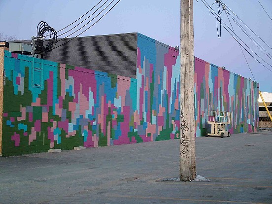
An antigraffiti measure, and companion to the Mural next door at 1420 Taylor. more graphic in nature, it was inspired by peoples' attempts to block out graffiti with mismatched colours.
|
Location: at rear of building; South Face
Occupant: Towers Realty Group
District: River Heights
Neighbourhood: South River Heights
Artist(s): Charlie Johnston (C5 Artworks)
Year: 2008
|
|
|
Charlie Johnston: "This one is a companion piece to the one next door (see 1420 Taylor).
In one sense it's more of a wall treatment than a Mural. It's very graphic in its nature.
The starting point of this Mural was to play on those wall treatments that cover up graffiti
and what happens when people try to fix tags on their buildings. They paint over them
with some paint colour; and the colours don't match and you end up with these blotches-
these loose rectangular patches on the side of the building. So I took that feeling and I
ran with it. I did the entire Mural with rollers- I think I barely picked up a brush."
"The colour scheme was based on the colour scheme for Urban Forest (see 1420
Taylor)- the magenta, the green, the blues, the grays, the very same colour scheme. You
can look at this wall treatment in two ways. It could be a finished piece as is, or it could
be the foundation for a future Mural. It's not haphazard or random; I wanted it to have a
finished feeling. There's all these different parts to Mural painting that aren't anyways
evident to the outside viewer. Like doing a background blend, or placing a figure in a
space, or doing a layout. This is like doing a colour layout on the fly, with nothing more
than less than 10 colours and some rollers. This is also about the physical process of
painting and what happens when you take a roller on a 20 foot pole and push it up and
down the wall. It could be seen as a giant pixellation. I used the same idea when I signed
it. My signature on that wall is pixellated as well! My name on that wall looks like one
of the very old video games, like Pong or Tetris."
"As humans we are organizers- we want to take the visual information and make sense of
it. I'm hoping that these two designs will make the viewer work a little bit more. A
piece is more exciting if everything isn't spelled out for you. You can look at a painting
and get a sense of how it's built- you can see the parts."
"I see great potential in continuing designs such as this one. Think about it. Murals as a
deterrent to vandalism. If someone is having a vandalism issue, maybe they don't have
the budget for a very complex design. It's about something that can solve the problem
and something that can be fixed easily. The nice thing about a design like this is that it's
very easy to fix. Anybody could fix this Mural. If this Mural got vandalized, anybody
could come with a roller and pick a colour- any colour!! It encourages the building
owner to participate in the process and begin to alter the design themselves with their
own colour swatches. I made sure there were more smaller patches at the bottom so that
if someone comes with a marker or something it can be fixed with a small patch or
several small or bigger patches."
|
|