|
|
|
|
|
|


|
|
1330 Portage Avenue
Location Map

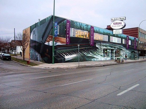
"Water Music".
|
Location: SW corner Portage & Craig; North & East Face
Occupant: St. John's Music
District: West End
Neighbourhood: Wolseley
Artist(s): Charlie Johnston (C5 Artworks)
Year: 2004
|
|
|
Charlie Johnston: "2004 was really a season of music for me. This one was looking at
music in another metaphorical way (than that of his other music-themed Mural in 2004,
see 190 Disraeli). I did the design rendering with Photoshop. It was a site shot
(see Photo 3) to give them an idea of what was possible. We had talked about other
possibilities: of someone playing the piano. But it was really about the piano keys
turning into water. That was the key element. Music has an atmospheric quality like
flowing water. Music flows like a river. Some of the metaphors are less literal, like the
idea or feeling that the forest is coming out of the cover of the piano. From a side view
the piano has an abstract quality. Sarah (Johnston's partner) thought that the lower left-
hand corner of the side wall looked like an alien landscape. It's also an exercise in
contrasts. There are different types of textures happening and coexisting."
"The whole area depicted here is from the Whiteshell area. I forget which lake it's
adjacent to but there's a small set of waterfalls and I used that as the reference. So the
colours of the water have the real look and feel of the Rapids. I wanted people to feel it
so that you can almost HEAR the rushing water as you walk by it. It really pulls you in
that way. There were a lot of painterly elements and considerations rather than
representational type things: the qualities of the water and the forest, the textures of
the keys themselves, the simple beauty of a reflection, the simple contrast of large black
areas, the cascading waters enveloping the whole face. I was using photographic references, but
it wasn't exactly the photographs, but more of the
feeling of it: of how water acts and reacts to itself, the way it plays off itself, the way it
splashes, the way it undulates, the kinds of tones that get created, the way it looks
when it is foaming or as it begins to settle."
"I chose a more open relaxed approach to this
Mural. Sometimes Murals are loaded down with imagery or lots of other stuff the client
wants in there. I wanted just the one key concept of the piano turning into the landscape
and the water cascading off the keys. I wanted to take that whole building and turn it into one
singular scene with that building corner disappearing and the piano taking on a three-
dimensional quality. Now, this piano was nothing like a real piano- the proportions are
all whacked out but were made to fit the dimensions of the east wall (the front wall portion of
the piano is optically perfect)."
"I never saw this Mural as being a commercial Mural at all. To me it was more about an
opportunity to do something more environmental, atmospheric. That front wall is really
the part that says to me that this is about music, about movement. Other things I had
done unconsciously came up while I was working on this like from the Fitzgerald Mural
(see 677 Portage) came to mind like the way some of the abstract elements were used. I
didn't really worry about conceptualizing too much- it was more about getting the feeling
and feeling my way through the painterly aspects of it."
"This project flowed quite smoothly and was fun to do and comes in at just under 4000
square feet. There was a lot of action painting with this Mural: listening to music,
dancing around, and going kind of crazy with the brushes and the rollers. Most of the
people I saw there were, rather obviously, into music; and they were all very responsive
to my work. One of the key elements that found its way into the work was that there was
a continuous flow of traffic the whole time. I think that affected the design: it was all
about movement!"
|
|