|
|
|
|
555 Ellice Avenue (1)

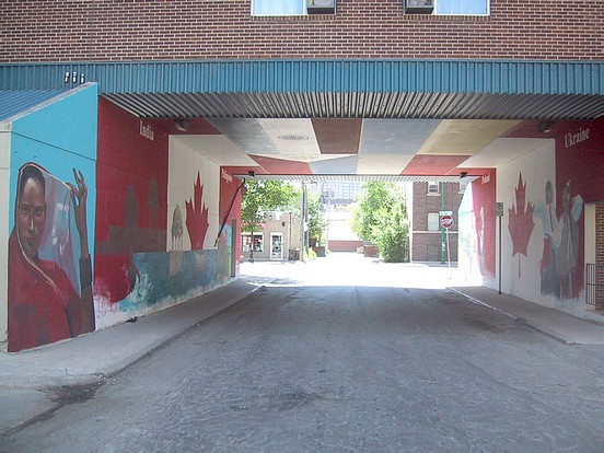
This is Mike Valcourt's Millenium Multicultural Mural, painted in 2000 with sponsorship by the West End BIZ.. Each wall is 65 feet long and 18 feet high. It is Winnipeg's only Drive- through Mural! It is also one of an elite but growing number of walls that is well illuminated for night viewing.
It was painted over in 2021 with a new Mural
Original notes Follow:====
Mike Valcourt: "I was approached by Take Pride Winnipeg and the West End BIZ to
come down to do a proposal for the wall. Harry Bergman (the executive director of the
West End BIZ at the time) envisioned all of Ellice Avenue adorned with Murals
celebrating our multi-ethnicity. For this millennium Mural, he wanted to incorporate as
many nationalities as he could. To make it a manageable number, we finalized it down to
four countries: Poland, Ukraine, India, and the Philippines."
"The original design and idea was just to paint the opposing goals in the tunnel and that
was it. About halfway through the design, I incorporated the ceiling as well. I figured
'why not' because painting the flags of the four countries on the ceiling helped tie the
Mural together. I actually taped the designs of the flags onto the ceiling. I wanted to put
the Canadian flag on the wall as the binding fabric, labelling them as Canadian; what sets
them each apart are their ethnic backgrounds. I selected elements from their respective
cultures which make each of them unique and put it up against the backdrop of the
Canadian flag."
"The woman of Indian descent on the wall is unveiling herself (photo 2). You can see
her face and it's very striking you can see it from very far away. I tried to be as close to
photo-realism as I've ever been, the highlights and shadows on the faces and more of a
three-dimensional look. The eyes really grab you; I was really quite pleased with the
result. The kid splish-splashing in the water having fun- I tried to use different colours in
the water help it stand out a little more. India is surrounded by water, so that is one of the
things I wanted to portray; the same as the Philippines so they both tie in together to both
of their cultures. With the Philippines you have the fishing boat, as a whole fishing
industry is very central to their culture. I included the islands school kids (photo 4), their
camaraderie, and it also shows a little bit of their colours that they wear. Each individual
school has its own colours and design so that just one of many. I used photo references
from a couple travel magazines. I like the kids, too; they stand out really well. I took
time to blend everything together with the faces."
"The geese (photo 3) came straight from a Poland brochure. There's nice countryside
there, I liked the terrain. That little piece juts out onto the sidewalk, so I wanted that to
draw attention; and I couldn't think of anything else that would draw attention better than
a nature scene. I also want to overlap the little Polish girl with the scene. With the Polish
girls, I wanted something that brought together the entire world. I thought of Coca-Cola
and Pepsi-Cola! It was my idea to incorporate the cans: one girl is drinking Coke and the
other is drinking Pepsi. There was some resistance to this idea; but it's not meant as
advertising at all, but rather the idea of coming together in peace and harmony. That's
what I wanted." (Note: the Coke and Pepsi cans WERE eventually replaced, photo
5)
"For the Ukraine, I chose the Ukrainian dancers. I did something a little different with
their arms I made it look as if they were moving. I made them vibrant, I made them glow
a little bit: all to suggest quick motion and as if they were under the spotlight. I think
there is the feel of the rhythm as well."
"This project took at least two months and went into late September. They didn't close
the street off, so to get the ceiling done I had to drag the scaffolding right out into the
middle and people had to go around me. It was cold! You get the wind ripping right
through there. I made up stencils for the flags on the ceiling. The only projection I did
was of the Canadian flag because I needed it to be perfect, especially all the points on the
maple leaf."
"The response to the wall has been great. It really brightens up the place. Before they
just an old grey walls, now it's a pleasure to drive through there. It's a drive-through
Mural!"
|
Displaying Photos 1-3 of 6
|
|