|
|
|
|
|
|
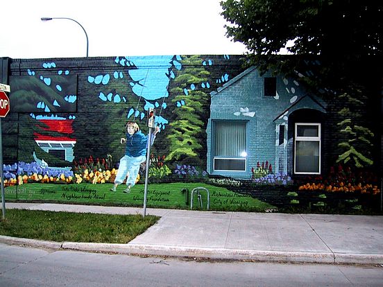
1553 Arlington Street

This artwork was rendered by Dennis Bell with assistance from Diane Bell in 2002. Sponsorship was by Take Pride Winnipeg!, Neighbourhoods Alive, Herc Rental, Winnipeg Foundation, Richardson Foundation Inc., and City of Winnipeg. After deterioration of the wall paint over the years, the building was completely repainted in 2019. Original notes follow:
Dennis Bell: "I went out to photograph this wall to plan the design, and I was thinking
'what am I going to do about those windows?' I thought of just abandoning the windows
and painting around them. But I thought there must be a way. I was flipping through a
magazine and I saw this house and I thought yeah we can do that; we can incorporate the
house into the wall. The house I rendered is kind of the style of house that's in that area.
I really think it was successful to me in the fact that the windows do fit the Mural design
so well."
"Diane (Dennis' wife) also suggested at the outset maybe adding a kid on a swing to the
scene. So I spent a few hours in the city Park asking parents if I could shoot their kids on
the swing for photo reference. I explained to each parent that I would not be using their
child's actual likeness. Some parents were obliging, others were not. So I ended up with
and used that angle of the child in full swing and made it quite large so it looked like she
was swinging right out. The child's face I completely made up."
"The project took about 8 days and was all done freehand. And I like it because the bus
stop and the stop sign are right there! They seem almost like part of the Mural (Dennis'
original sketch actually included the landscape scene including the wall with his
incorporated design, the sidewalk, stop sign, bus stop and part of the street corner
including part of the storefront awning- to show how the Mural would look in the context
with its surroundings)."
"I wanted to play with the contrast of the red and the green. There was so much green, so
I thought a red roof would look really good. I wanted that complementary red and green
and started playing off those two colours. There's a bit shift in the sky where I added
more skylight and less tree line from my original sketch, but otherwise I stayed true to
my original design."
|
|
|