|
|
|
|
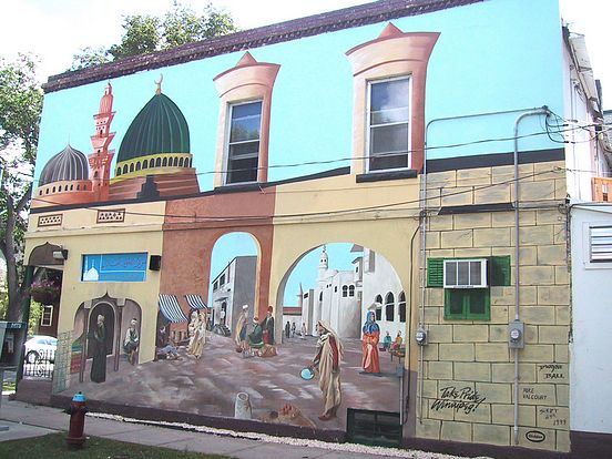
206 Maryland Street

The artwork for this wall was rendered in 1999 by Mike Valcourt and Dwayne Ball. Sponsorship was by Take Pride Winnipeg, Glidden Paint, and Altered States Scaffolding. The Mural was completely redone and completed with a new Mural in 2012.
Original notes on 1999 project:
Mike Valcourt: "Dwayne Ball was the lead artist. Dwayne had come by to give me a
hand on the Legion Mural (see 1755 Portage in RIP section); and then he invited me to help him with this
one. The scene is a mosque and an open market. These people are from different places
and ethnic backgrounds, as evidenced by their attire. The tough part of this was
incorporating it all into one Mural and making it all work together. Dwayne and I had
artistic differences on this wall. I'm more happy and satisfied with the things I've done on
this wall than what Dwayne did."
"I painted several of the figures on this wall. I painted the shopkeeper (left center) just
sitting there thumbing his beads and watching the customers. The figure in the
foreground holding the mirror was also my idea. I painted him pretty much lifesize, and
he's holding the mirror at such an angle that the top of his headwear is visible through the
reflection in the mirror. In this male-dominated environment, I only included one woman
in the scene."
"It was cold, late September. It was rainy, and we had to tarp up the scaffolding so we
wouldn't get wet. We had heaters inside the tarp to keep things warm. The store owner
was very nice, and the driving force behind the idea of the Mural. He was concerned
about the authenticity of everything; so he kept us on our toes and was out every day
talking to us. He also provided us with a couple of excellent photo references. I had this
(authenticity) in mind when it was painting the figures- their attire, and even their body
posturing. The scene itself, though, was taken straight from Dwayne's imagination with
a bit of input from me."
"I like this Mural because this is the first wall I painted people to actually look like
people. Instead of just skin tones I used browns, highlights and shadows. I really got
into it and I enjoyed it. Most people seem to know this Mural; it's in a highly visible spot
and is bright and vibrant. That's how people comment on it to me and how they are
drawn to it. We made the windows disappear! You hardly notice them at all with the
two columns up there."
|
Displaying Photos 1-3 of 3
|
|