|
|
|
|
123 Red River Boulevard West

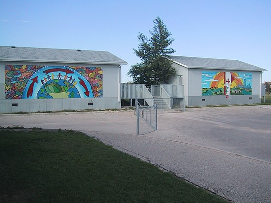
This pair of Murals for École Riverbend
were rendered by the artistic team of Mandy van Leeuwen and Jennifer Johnson in 2001; with sponsorship provided by Take Pride Winnipeg and Winnipeg Foundation. These portable classrooms were removed from this spot in 2010.
Original notes follow:
Jennifer-"In total I think there were just over 50 kids. It was a grade four and five class
and they were the ones that were in these portables. In front of the portables is a parking
lot that has high visibility so instead of looking at a gray wall the school wanted to do
something to dress it up. Also the students that were being taught in these portables were
going to be leaving the school and going on to the next level and wanted something that
would pertain to them, a legacy. That's a lot of the reason why the handprints are on
there, so they could claim ownership too. The kids came up with numerous designs and
Mandy and I took the sample drawings and paintings that they did and came up with a
design that encompassed them and something we thought would have a flow between the
two murals. For instance, the Oval on the left is half the earth and the Oval on the right is
the sun coming up over the horizon."
Mandy- "We took crezone boards and laid them out on the grass. We had a layout on the
boards already and we'd instruct the kids of where the colours should go- we had done a
previous prototype picture on a smaller layout on a board to show them and serve as a
reference point for them of how it would look. The end result of the project is that we'd
pull out the creative side from the kids and put it into the project with some of their own
ideas. With this relatively young age group there was only so much freedom we could
give them so that the guidelines would work out as well. But you still wanted it to look
like they had done it themselves. We think it was quite successful. They enjoyed it and
learned a lot."
"The kids expressed their creativity quite a bit in the mosaic shapes at the sides and in the
rays of the sun. It was experimental- there were just layers and layers of colours. There's
also a lot of 'dot art' here. There's also the multicultural theme with the figures standing
on the surface and breathing the atmosphere, with a west to east wind or perhaps a
recycling theme. These people are taking care of the earth. And our heart is in Winnipeg.
The colour blending utilized here (for example the clouds) was on an introductory level,
due to the age of the children."
Jennifer: "The idea for the edges (Photo 2) came from one of the student's drawings.
There were so many kids. One day we had all 50 working out there. And we had to find
a way to keep them busy and interested. We set up so that they could just slap on the
paint and go. There is a quarter inch of paint on here in some places. The patchwork
idea helped us out a lot because the kids could paint in areas all they had to do with stay
inside the lines and after that they did dots all over. It was fun it was different and they
could move around. In this one (Photo 3), they wanted to show the school and the district
of the city; it's on the northern tip of the city and to have the Canadian flag on there and
that they were also from Manitoba. We wanted to have it multilayered- the grass is
greener by the river just so that we can change it up and give it some interest. That was
basically the concept for it."
Jennifer- "After the main project, I did a six week art program at the school and the
children got to design their own mural (Photo 4) that went into the corner. There were
some benches built by the caretaker and janitor as well. We painted those. They had a
support beam and we painted some flowers at the base of the support beam. And then we
made it into a tree trunk we cut it out of plyboard and painted and fastened it to the
support beam with wire. We were teaching them perspective- for instance the road gets
smaller the more as it goes off into the distance. And the children in the front are a lot
bigger than the ones in the back. A lot of the kids did the majority of the drawing this
themselves. Overall I think it was an area they were proud of."
|
Displaying Photos 1-3 of 4
|
|