|
|
|
|
1520 Portage Avenue

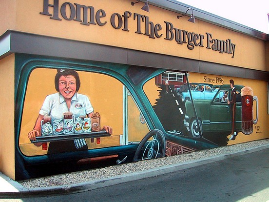
This 2006 Mural was commissioned by A & W Canada in honour of A & W's 50th anniversary. It was rendered by artist Tom Andrich (Eclectic Fine Arts). The Mural was lost in July of 2010 with renovations to the exterior wall.
Original notes follow:
Bob Buchanan: "This one started with a phone call from Steve Sidloski, who is
the
regional manager for the A & W's in Manitoba and Northwestern Ontario. Steve's
brother Leonard had been one of our mural judges for the 2003 Mural of the Year.
Steve
wanted a new Mural in honour of A & W's 50th anniversary in Canada. We talked
about what was wanted and about me finding them a suitable artist. I fanned it
out to a
few of our best that I knew were or could be available. Steve and his
associates looked at
two artists, and ended up going with Tom Andrich, who does great work."
"The client wanted something that was retrospective and fondly reminiscent of
older
times; and also something that was loyal to the A & W brand. Tom saw this as a
perfect
opportunity to work in the car hops theme, which they just loved! They were
very
pleased with Tom's maquette (Photo 5). They really liked the first person
perspective
from the front seat of that car, which Tom tells me is a 1940 Chevy Coupe with
the split
windshield. That's Tom's wife Judy bringing the food order to the car. Tom had
her
pose in that position as his model. He changed the hairstyle and colour but you
can see
from the face that it's definitely her! Tom did research on the car hop
uniforms so he'd
get it right on the wall."
"This is the wall you drive along in the drive-through just before you get to
the pickup
window (see the wall 'before' view, Photo 2). The Mural's really most striking
when it's
viewed standing at the left side, from that front seat perspective- and the same
way it gets
experienced by the drive-through customers now (see Photo 1). Remember where
this restaurant is,
too- right on Portage Avenue. All the vintage cars in this lovely scene to me
are like a tip
of the hat to the long tradition of Sunday Night cruising here in Winnipeg.
Other than the
1940 Coupe, Tom decided against representing any specific vehicles in the scene-
the
ones you see are composites of different models and types."
"I think Tom aced this wall. The A & W mug is fantastic when you stand next to
it; great
detail as well to all of the food products on the tray- very accurate. The
client is very
pleased. I think the thing I like about it the most is that it's a commercial
quality wall
without being so sterile or photorealistic that it lacks character. For A & W,
I think that's
perfect!!"
Tom Andrich: "After I found out I got it, I did a couple of drawings. I went to
the A & W on Main Street and took photographs of their photographs. I went
online to do some research on uniforms and got all the old photographs I could
get."
"I sat down with them to plan it out. They didn't want the Root Bear or Chubby
Chicken (because they are more recent things). They did want their onion rings
and the family of burgers. So after that first meeting, that's what I
concentrated on. From the carhop photographs I had, I figured out which ones
would be the best to use. I didn't have any with the car hop serving- that's
why I got Judy to pose for it so I would have a figure in the window."
"What I especially enjoyed doing was that mug of root beer (Photo 4). I really enjoyed
that. I wanted people to look at it and get thirsty. The mug that I put there
is from the 50s that has little indentations around the top. I didn't want to
use a new mug, but the old one with the old logo and design and finger
indentations. Craig (the owner) had some of the old mugs so I took it outside,
put it on my scaffold and drew it! That helped me with the logo, the lighting
and indentations, and also the way the light reflected off the bottom of the
mug."
"The Mural didn't take that long to actually render onto the wall- I spent a lot of
time with the research. I had a lot of people come by while I was there and
everybody loved it. It went quite smoothly. The wall looks fairly smooth, but
it was pitted- there were a lot of small areas that I had to go over a lot. I
finished it in time for their 50th anniversary so that it would be there right
at the beginning of the summer. They did some PR with it and later in 2006 went
on to have car hop days on Tuesday evenings."
|
Displaying Photos 1-3 of 5
|
|